Hohner never settled on a single logo for their guitars in the nearly sixty years they were making them. But there were some that cropped up again and again. Here’s my attempt at a timeline of logos that appeared on headstocks – logos used on soundhole labels, packaging and promotional material will have to wait.
Prehistory

The Berkeley guitars were made for Hohner London, as M. Hohner Ltd styled themselves at the time. My best guess is that they were made in the late 1950s.
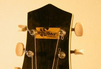
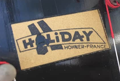
Around 1960, the Holiday archtop guitars were made for Hohner France. Hohner France also later used the Holiday brand on acoustic guitars sourced from Japan.

Around 1961, Hohner London had a series of solid body guitars made for them in England. This is a Zambesi. Other models include Amazon, Apache, Holborn and the Ambasso bass, which all had a similar logo or no maker logo at all.

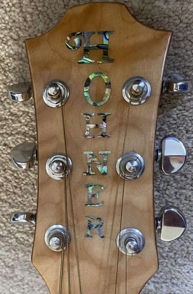
For most of the 1960s and early 1970s, very few guitars were produced under the Hohner name – the company mostly used Contessa branding for guitars. This is an HG-670 12-string provisionally dated towards the end of the 1960s. It was probably made in Germany, and the simple block logo is one that’s found on many other Hohner musical products such as accordions and harmonicas.
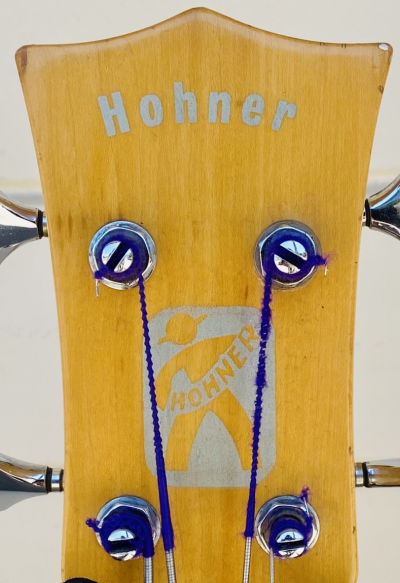
In the very late 1960s, the Bartell company of California made some (mostly fretless) basses for Hohner USA. Most have the uppercase logo seen on the left. The example on the right may be the only guitar to have ever had the Hohner man on the headstock.
Early Japanese production
As the 1970s came around, Hohner started sourcing most of their guitars from Japan. For the first few years, many were still branded Contessa but there may also have been some Hohners.

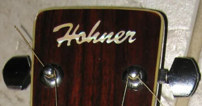
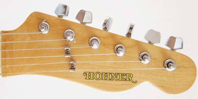
There are a number of Japanese-made Hohners with this logo, usually Telecaster or Stratocaster copies. These could possibly be from the first half of the 1970s (but see below because they may be the last Japanese produced Hohner guitars from around 1983). If they are, these would be the earliest examples of what is sometimes called the ‘teacup handle’ logo. This always has a scroll on the first H and, depending on the headstock shape, an extension or scroll on the R. Later examples were usually a solid colour (or inlay on expensive guitars), but these examples are always gold with a black border.
I’ve seen it suggested that the teacup logo is based on the HS Anderson logo. The guitar above is a 1975 model HS Anderson, which is a brand of the Japanese manufacturer Moridaira. Moridaira (a.k.a. Morris) definitely made guitars for Hohner and for several years in the late 1970s and early 1980s were the main supplier. I suspect the logo is a coincidence, but it’s certainly an interesting one.
There’s still a lot to discover about what guitars Hohner were producing in the first half of the 1970s. The Contessa range seemed to consist mostly of acoustics. While there are some electrics undoubtedly from the early 1970s, there’s very little documentation of them and it’s unclear which factories were making them. When Hohner electrics have been dated to before 1976, closer examination usually reveals there’s little supporting evidence for the date or it is based on a misinterpretation of a serial number.
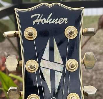
One exception is this very rare Les Paul Custom copy. It’s been dated to around 1974, and that is plausible based on the use of the Gibson protected ‘open book’ headstock shape and ‘split diamond’ headstock inlay. These features were long gone by 1976 when the better documented era of Hohner guitars started, as Gibson had started protecting their rights to the headstock shape and inlay more vigorously. That makes this the earliest dateable appearance of the Hohner script logo, which was heavily used for the next few years.
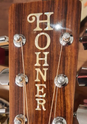
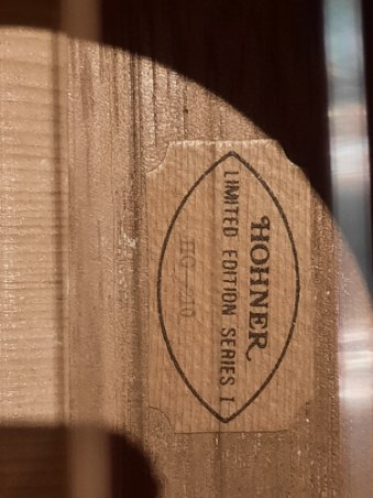
Sometime in the early 1970s, Hohner produced a very small run of guitars with a wooden ‘movie ticket’ style label under the soundhole which read “Hohner Limited Edition Series 1”. It would make sense for these to have been produced around 1974, except for the fact that one owner claims to have an original bill of sale from 1970. In any case, this is probably the first appearance of the vertical ‘teacup handle’ logo which adorned higher-end Hohner acoustics and archtops into the 21st century. Known model numbers in Limited Edition Series 1 include the HG-200, HG-210, HG-220, HG-230 and HG-240 (not to be confused with later guitars re-using the same model numbers). The HG-200 is a nylon classical and the neck block is stamped MG-24, which is a Morris model number. So it’s likely these were made by Terada on behalf of Moridaira for Hohner. There are very few of these guitars – fewer then ten have surfaced across all five models – and most of them seem to be in, or have been in, Canada.
Hohner International
In 1974, Hohner registered the trademark for Hohner International. They then started expanding their range of guitars under the Hohner brand.
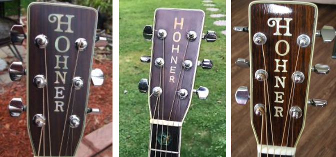
Amongst the acoustic guitars, the HG-300 series, HG-700 series, and HG-900 series guitars exclusively used the teacup handle logo. The exception is that some HG-320 guitars have the plain logo seen in the middle of the above picture. This was bought in early 1976 and is still in the possession of the original owner. The other two guitars above are also HG-320 models and you can see that the one on the right has a longer logo extending beyond the tuning pegs.
Some other models outside those series also used the teacup handle logo – HG-26, HG-512, HG-07 and HG-07E.
The remaining acoustic guitars in the range used a script font. Often, these were folk guitars rather than dreadnoughts and had been carried over from the Contessa range, which used a similar font and placement for the logo. But there are exceptions. The picture above shows an HG-200, which is a dreadnought but one that had a Contessa equivalent model. Sometimes models that started with a script logo have been seen with the teacup handle logo. Production moved factories and even countries (to Korea) in the life of these guitars, and the logo change may be indicative of that.

Hohner also expanded their electric range in the second half of the 1970s. High-end models – HG-460, HG-470, HG-480 – got the teacup logo. The HG-800 series (electric archtop) also used the teacup logo.
The most famous Hohner of all is the HG-490. This was a version of the HS Anderson HS-1. The Moridaira factory, which made the HS Anderson guitars, produced a limited quantity for Hohner with their logo. One of those found its way into Prince’s hands and became his favourite guitar. This is a horizontal variation of the teacup handle logo, possibly the first to have the curve and use a large font – a variation that would become more common.

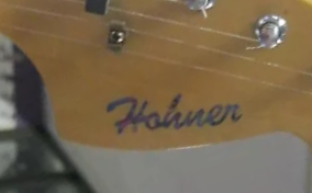
The Les Paul and SG copies in the range used the script logo seen on the contemporary acoustics. Above is an HG-430LP.
The Fender copies used a dark pearloid version of the script logo. This is from an HG-425 Telecaster copy.

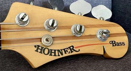
This is an HG-455PB bass.

The budget Telecaster-ish HG-420 had a gold with black border version of the script logo.

By the early 1980s, Telecaster and Stratocaster copies were using a bold black version of the teacup handle logo first seen on the HG-490. Above is an MS35 (UK designation). Les Paul and SG copies used the same script logo as before.

In the early 1980s, Moridaira made a through-neck guitar and bass for Hohner which had inlaid teacup logos with a concave curve. The IG786 bass version is pictured.
This is the same bass but with the bold black transfer logo. It’s unclear whether one replaced the other, and if so which way round.
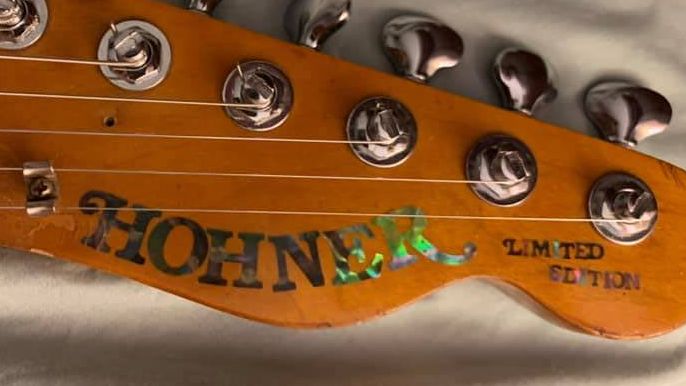
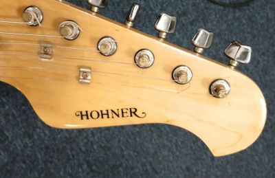
This is a Hohner Telecaster headstock from the August 1983 edition of Music UK which looks the same as the one I speculated as being early 1970s further up. So maybe all those white Telecaster and Stratocaster copies are actually the last gasp of Japanese Hohner production before the whole shebang moved to Korea.
This a better (but undated) image of what appears to be an identical guitar.
Korea and Hohner Professional
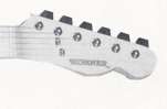
When the production of electric guitars moved to the Cort factory in Korea, a number of Stratocaster and Telecaster copies were made with a very small version of the straight horizontal teacup but with a more exaggerated scroll on the R.
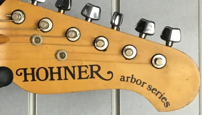
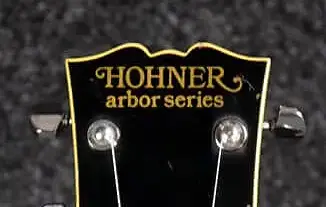
When the Strat copies with the small teacup logo became the Arbor Series, the logo was retained but made considerably larger.
The Les Paul version of the Arbor series used a similar logo in a different layout.

There is a group of guitars which have a wavy Hohner logo – common on keyboard products and packaging but rarely seen on guitars. This is a TE PRINZ with an authentic looking body but with a Strat-style headstock with the wavy logo.
This is essentially an HTB1 but with a slightly different headstock shape and the wavy logo.
This is from something vaguely like an RR Custom (a Randy Rhoads offset V model) but which is actually considerably different from the production version. What it does closely resemble is the Cort RR1003T model.
So it seems like these are pre-production models made for Hohner by Cort around 1984/1985 before Hohner had decided on final branding.

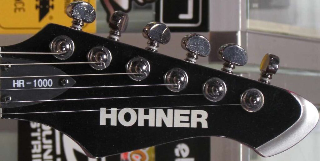
In 1985, Hohner introduced the Hohner Professional logo, initially for the Korean-made B2 headless bass guitar. So, technically not a headstock logo as the guitar didn’t have a headstock. This logo was used on the G2/G3 headless guitars and ‘The Jack’ bass which had a more traditional body shape but still no headstock.

The Hohner Professional range soon added many other models. The core of the range for many years were the “ST” Stratocaster type models, the “L” Les Paul type models and the “TE” Telecaster type models. For several years the range also included interestingly shaped and coloured guitars with names like Devil and Heavy, because it was the 1980s.
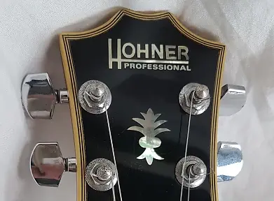
Early L59 models (up to the late 1980s?) had an intricate inlay sometimes referred to as “the antlers” under the logo.
There was apparently the opportunity for making errors while applying the logo. This L59 with a reversed N was advertised in Germany in 2025.
A small side quest
One of the guitars introduced into the Hohner Professional range in 1985 was the TE Prinz. This was a copy of the very rare Hohner HG-490, since made famous by Prince. Hohner made versions of this guitar on and off for the next 25 years.
A reminder of what the 1978-ish original HG-490 looked like.

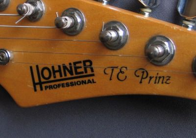
In 1985, Hohner added the model TE PRINZ to their Professional range. For the next few years, it had the Hohner Professional logo and “The Prinz” on the headstock.

There are at least a couple of these guitars, one owned by Wendy Melvoin formerly of Prince’s band The Revolution, which just have the Hohner Professional logo and at a different angle to the others. It’s not clear if these are the very earliest production models or ones made when Hohner was nervous about Prince’s lawyers.
In the 1990s, Hohner reissued the TE PRINZ but with a different shaped headstock which now actually says TE Prinz.

In 2008, Hohner reissued the Prince guitar again as the HTA-490 Hohner The Artist. The headstock changed shape again but did have a beautiful inlaid logo reminiscent of the original HG-490.

Also in 2008, Hohner sold a limited run of the Hohner The Artist Elite Black Prince guitar, which were made by a Czech luthier.
So there we are, the still not completely understood history of Hohner and Prince told through the medium of headstock logos.
Back to the timeline
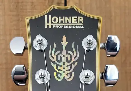
Later L59 models had a more basic inlay sometimes referred to as “the pineapple” under the logo.
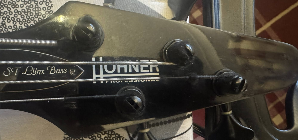
When they tried to put the Hohner Professional logo on a new bass headstock design, it didn’t really fit. This is a 1990 ST Lynx Bass, which never went into production.
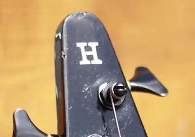
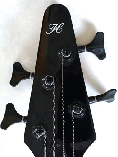
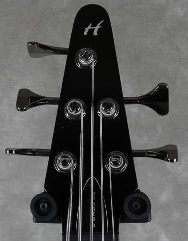
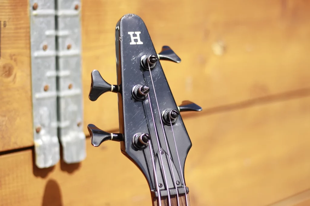
So when the new headstock design was used on the B Bass model, they used an H on the tip of the headstock …
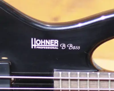
… and put the logo on the body.

Meanwhile, the HMW series of acoustics (and other acoustic models) had started using a gold block logo again. This is an HMW400.
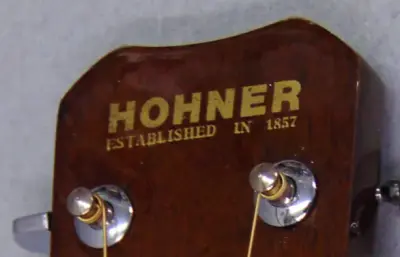
Sometimes, they also added “Established in 1857”. This is also an HMW400.

Austrian musician Falco had a signature bass around 1989 which had a unique logo.

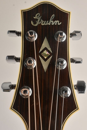
In 1991, Hohner commisioned Nashville guitar dealer and designer George Gruhn to design a series of guitars for them to be made in Korea. On the left is a Hohner Gruhn D1. The guitars had a unique (for Hohner) headstock design and logo, which were somewhat based on guitars Gruhn had commissioned from luthier Bill Collings in 1988/1989.
In the early 1990s, the Revelation series of guitars was developed by a division of Hohner calling itself Hohner Guitar Research. These guitars had the company logo on the truss rod cover.
The logo was often just impressed in black-on-black and was sometimes accompanied by “Guitar Research”.
Script and Revolution years
From 1996 through to the end of guitar production in 2017, the Hohner Professional logo was only used on the headless basses and guitars.
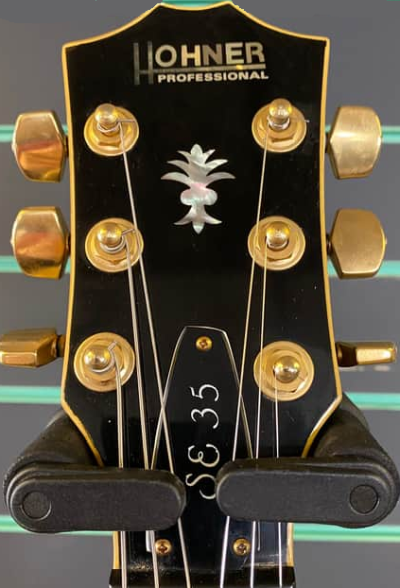
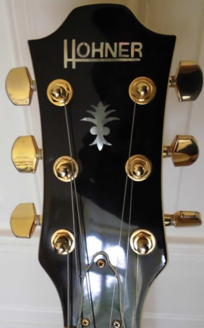
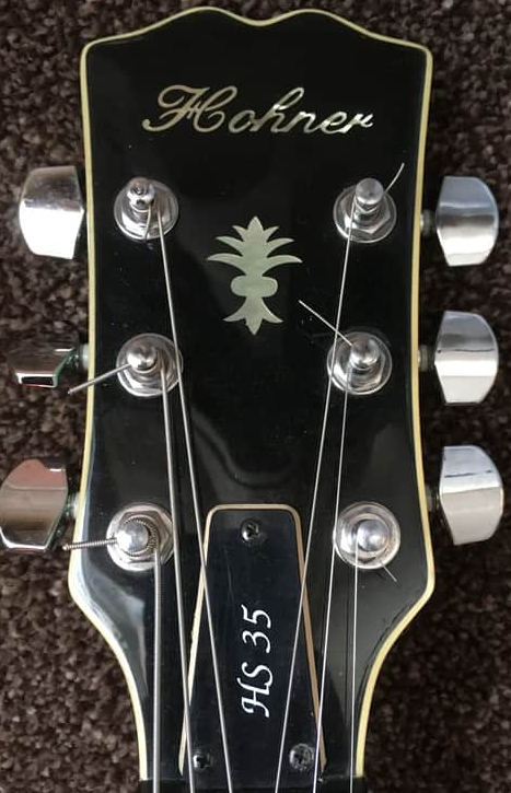
The SE 35 was a semihollow ES335 copy introduced in 1990. It had the standard Hohner Professional logo (left, above). In 1996, the electric guitar model range was renamed (and in some cases redesigned). The SE 35 became the HS 35 with a cursive script logo (right, above). But for a very short period, there seem to have been some guitars produced with the old Hohner Professional logo without the Professional. This example also seems to be missing the headstock binding and is in a non-standard sunburst finish, so is unusual in many respects.

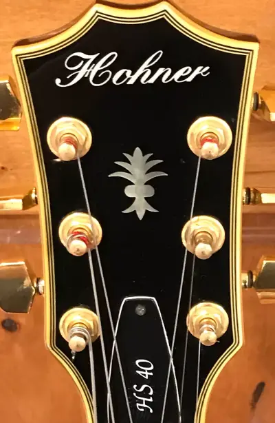
The SE 400 Super Jazzline went through a similar transition. This fully hollow electric guitar was renamed the HS 40 in 1996. It was basically the same specifications and still called the Super Jazzline but it now also had a cursive script logo. The HS 40 went through a few variations after that, but the logo stayed the same.
The B Bass was also refreshed with a script H on the headstock.

In the late 1990s, the Caribbean Pearl series featured some very blingy finishes and the cursive script logo.

Here’s a slightly more legible (if not any less blingy) logo.
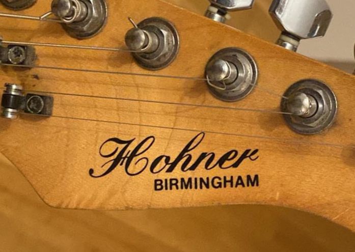
The Classic City series of guitars used the same cursive script logo. This is a Hohner Birmingham.

This is a Reno, The other models in the City Series were Springfield and Baton Rouge.
In the early 2000s, the Hohner guitar range was massively consolidated. Survivors included the headless basses and guitars using the Hohner Professional logo; B basses using the headstock H logo and sometimes the Hohner Professional logo on the body; and the jazz guitars (HS35/HS40) still with the cursive script logo.
The new line of guitars were the Revolution Series – a variation on the 90s Revelation guitars (in fact they went back to being called Revelation in the 2004 catalogue). These had a brand new logo – yet another script style which I’ll call Revolution.

This is an HRB DLX bass.
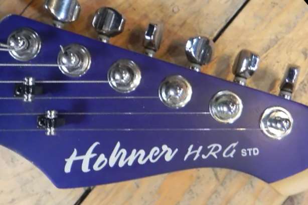
This is an HRG STD guitar in a striking purple finish.
In 2004, the B Bass line was refreshed and the solid H headstock logo was replaced by a Revolution script H.
This is a B Bass 5Q (5 string quilted top).
This is the evolution of the B Bass headstock. Style one is from 1990 to 1996. Style 2 is from 1996 to 2004. Style 3 is from 2004 to 2009.
Later years
Hohner made guitars until around 2017, but the Revolution script was the last new logo. There were some interesting cases of reuse of existing logos though.

The Ebony Series guitars were high-end acoustics produced for a couple of years in the mid 2000s featuring ebony sides, back, and fingerboard. They had their own special variation on the Revolution script H. This is an EBDG dreadnought.
The vertical teacup logo was still commonly used for higher end acoustics. This is a JM-775 from around 2006.
The HS35 and HS40 jazz guitars were completely redesigned and adopted the Revolution script logo (which is one way of telling whether you have an earlier or later one).
The HR and MR series guitars introduced in 2007 used the block font logo.
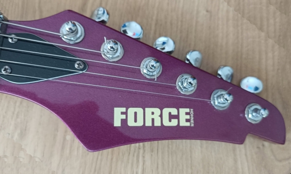
FORCE (by) Hohner was a range of guitar amps from the 2000s. This so far unique guitar has the same logo so may be from the same era.
